Prism is an initiative with Sketch that began in 2021. It started as a redefinition of its direction as an organisation, and grew into a project that changed the brand, web platform and daily processes.


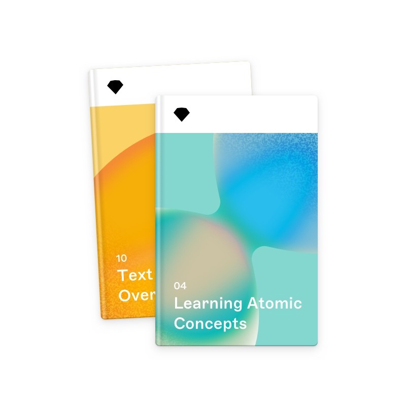
Early storyboards for a conceptual video
My colleague of the last 8 years Prekesh Chavda and I, were tasked to work on a new campaign to announce a reshaping of the platform. Early on, we explored storyboards for a video, with new visual treatments that severed ties to the existing Sketch brand, as a means of exploring what we could be in future and how we could announce it.
This was guided by a script written by our wordsmith, Freddie Harrison. We arrived at a place that wasn't too literal and gave focus to motion and the narrator's words.
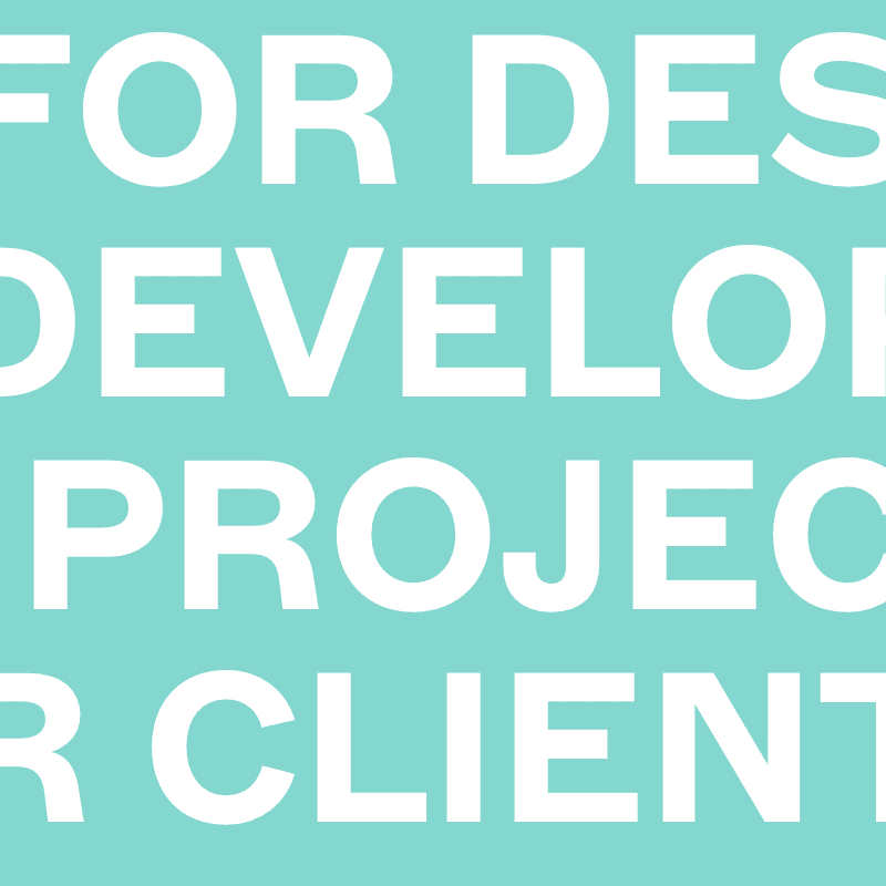
A platform for the entire collaborative design process.
Finalised by Emma Kingsnorth's animation, we released the video alongside an announcement designed by Emily Cressey. This launched a campaign that partnered with the arrival of our collaboration feature on Mac.
Proud of the success and creativity shown in this, Prekesh and I started to grow Prism into two different branches. While he worked on content design to support our branding and marketing efforts, I began to focus on product design and how this new ethos could reshape our web platform.

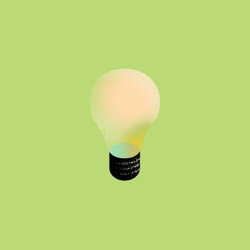
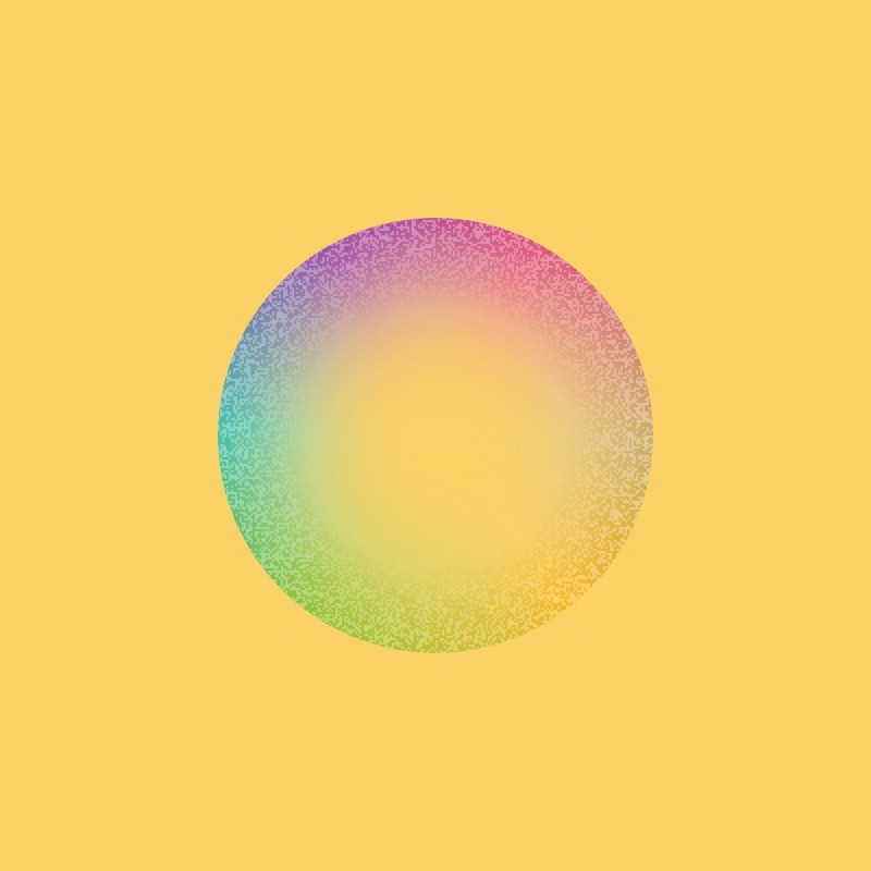
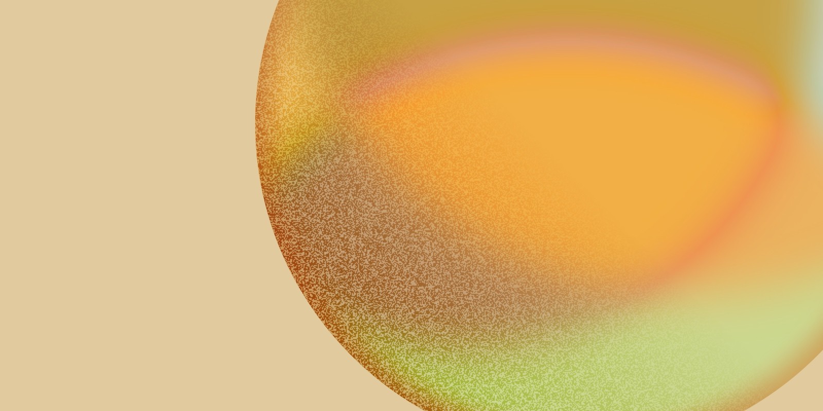
Moodboards, a designer's favourite playpen.
To think about the applications of the new aesthetic and design philosophy, moodboarding was done to see "the vibe" in context. It helped us explore the typeface choices, color pairings and an evolving illustration style.


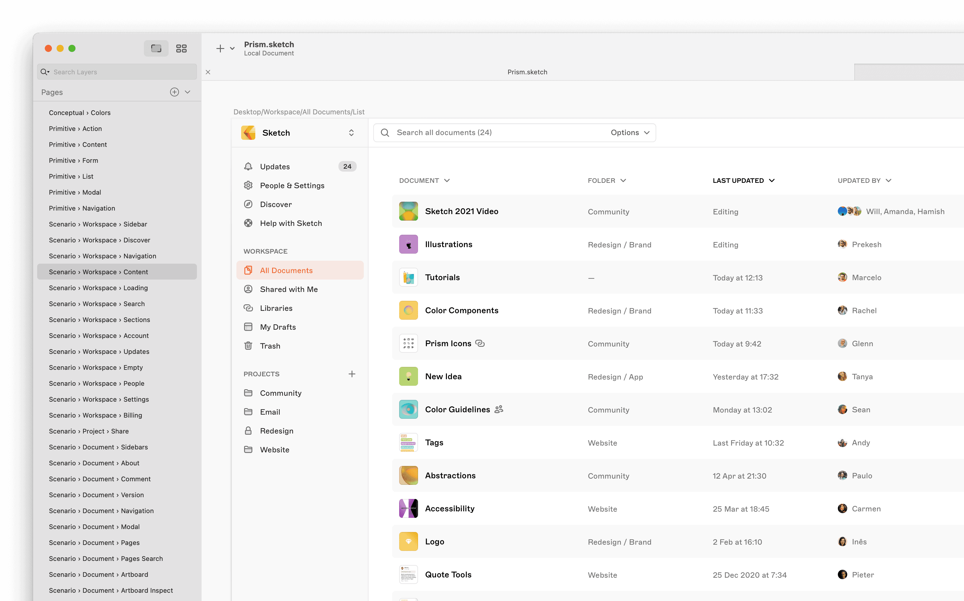
Early interface experiments of core views.
I developed the language further within the context of our web platform, demonstrating core views such as the workspace, document, artboard and homepage views.
This wasn't just an exercise in style. The goal of Sketch's service is to involve everyone in design. That creates more features, more space used, and is a balancing act of many needs and wants.
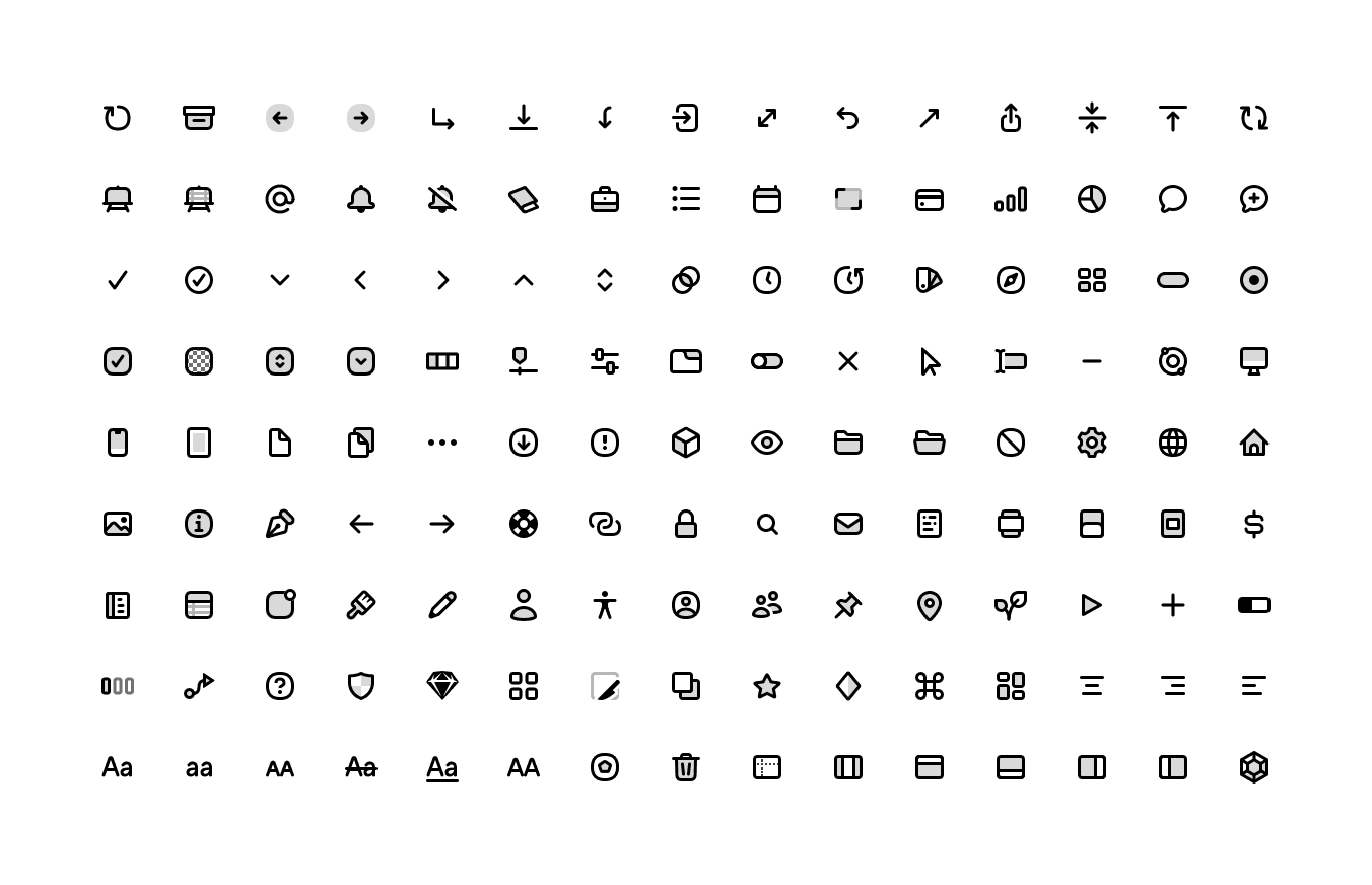
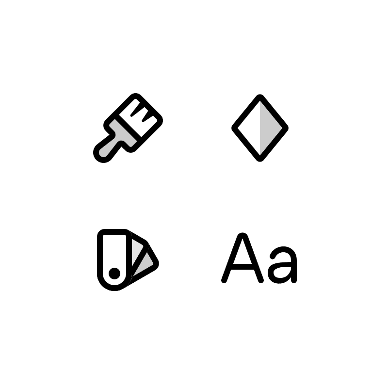
16px icon set, with contributions from the team over time.
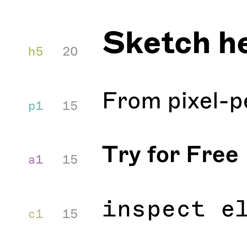
With this remit, I reconsidered each view; layout, information hierarchy, navigation and flow were all areas to be improved. Our design fundamentals too, with colours, text sizes, buttons, selectors, toggles, and so on created from scratch.
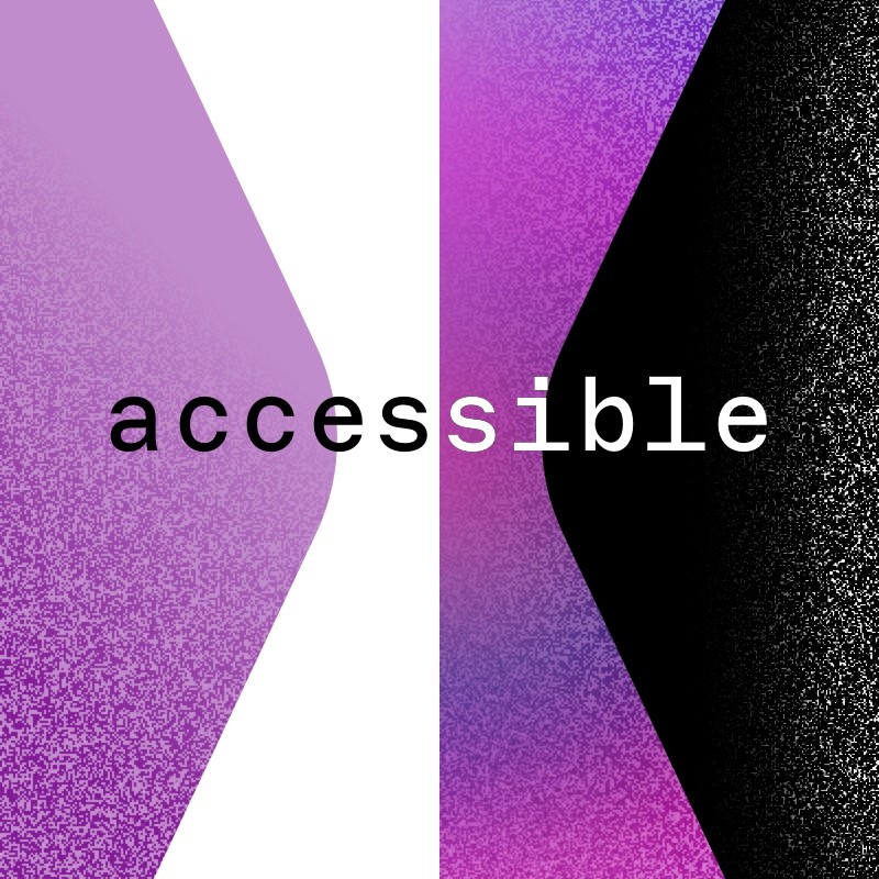
This was done with readability and accessibility in mind, with each text colour combination checked against WCAG 3.0 standards.


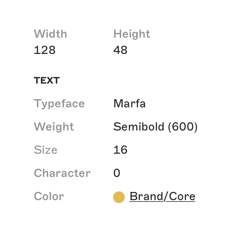
58 of 1808 Symbols.
With the project validated, we grew in scope again. We would redesign the entire web platform for the Summer of 2021 using these new principles. This demanded a reconsideration of every area, and having close communication with front-end developers Marcio Barrios and Inês Carvalho to formalise a design system that all parties could interpret and rely on.
For me this meant assessing each part of the experience, improving on it to match our product goal, and recording each permutation into Sketch's first fully-fledged design system. This served as a goalpost of where our Summer project would go, and then be used as a source of truth to continually update in future.
It also afforded the opportunity to audit our product language, with our UX writer Jürgen Zimmerman providing a suite of copy rules to ensure correct terminology, sentence structure and guidance was given to users throughout.
Yes, this is a very long list of separate pages. Systemising an entire website from A → Z does that.
The end result of all of our work shaped the organisation in many ways.
For our customers, they received a new experience for Web, with the level of polish we know and love of the Mac application. Accessible, responsive, systemised. A dependable and predictable level of service.
The team inherited new processes. They received an iron-clad source of truth for visuals and experiences. A workflow was set up to maintain and evolve the system, with individual staff members responsible for its upkeep, and validating the quality of new concepts being sent to it.
Lastly, this bled into the redesign of Sketch.com itself, and spawned a sister-system called Carat, which is the source of truth for all content marketing related design language. To this day, Keir Ansell diligently curates both systems.
This ecosystem brings the ever-growing Sketch design team together, and encourages contributions from the wider team to keep furthering the product.


Some final screenshots.
Prism is an initiative with Sketch that began in 2021. It started as a redefinition of its direction as an organisation, and grew into a project that changed the brand, web platform and daily processes.
Early storyboards for a conceptual video
My colleague of the last 8 years Prekesh Chavda and I, were tasked to work on a new campaign to announce a reshaping of the platform. Early on, we explored storyboards for a video, with new visual treatments that severed ties to the existing Sketch brand, as a means of exploring what we could be in future and how we could announce it.
This was guided by a script written by our wordsmith, Freddie Harrison. We arrived at a place that wasn't too literal and gave focus to motion and the narrator's words.
A platform for the entire collaborative design process.
Finalised by Emma Kingsnorth's animation, we released the video alongside an announcement designed by Emily Cressey. This launched a campaign that partnered with the arrival of our collaboration feature on Mac.
Proud of the success and creativity shown in this, Prekesh and I started to grow Prism into two different branches. While he worked on content design to support our branding and marketing efforts, I began to focus on product design and how this new ethos could reshape our web platform.
Moodboards, a designer's favourite playpen.
To think about the applications of the new aesthetic and design philosophy, moodboarding was done to see "the vibe" in context. It helped us explore the typeface choices, color pairings and an evolving illustration style.
Early interface experiments of core views.
I developed the language further within the context of our web platform, demonstrating core views such as the workspace, document, artboard and homepage views.
This wasn't just an exercise in style. The goal of Sketch's service is to involve everyone in design. That creates more features, more space used, and is a balancing act of many needs and wants.
16px icon set, with contributions from the team over time.
With this remit, I reconsidered each view; layout, information hierarchy, navigation and flow were all areas to be improved. Our design fundamentals too, with colours, text sizes, buttons, selectors, toggles, and so on created from scratch.
This was done with readability and accessibility in mind, with each text colour combination checked against WCAG 3.0 standards.
58 of 1808 Symbols.
With the project validated, we grew in scope again. We would redesign the entire web platform for the Summer of 2021 using these new principles. This demanded a reconsideration of every area, and having close communication with front-end developers Marcio Barrios and Inês Carvalho to formalise a design system that all parties could interpret and rely on.
For me this meant assessing each part of the experience, improving on it to match our product goal, and recording each permutation into Sketch's first fully-fledged design system. This served as a goalpost of where our Summer project would go, and then be used as a source of truth to continually update in future.
It also afforded the opportunity to audit our product language, with our UX writer Jürgen Zimmerman providing a suite of copy rules to ensure correct terminology, sentence structure and guidance was given to users throughout.
Yes, this is a very long list of separate pages. Systemising an entire website from A → Z does that.
The end result of all of our work shaped the organisation in many ways.
For our customers, they received a new experience for Web, with the level of polish we know and love of the Mac application. Accessible, responsive, systemised. A dependable and predictable level of service.
The team inherited new processes. They received an iron-clad source of truth for visuals and experiences. A workflow was set up to maintain and evolve the system, with individual staff members responsible for its upkeep, and validating the quality of new concepts being sent to it.
Lastly, this bled into the redesign of Sketch.com itself, and spawned a sister-system called Carat, which is the source of truth for all content marketing related design language. To this day, Keir Ansell diligently curates both systems.
This ecosystem brings the ever-growing Sketch design team together, and encourages contributions from the wider team to keep furthering the product.
Some final screenshots.